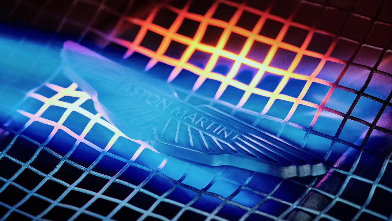
The wings in the Aston Martin logo have undergone a modern makeover in an effort to attract a “a wider, affluent global audience”.
![]()
0
It turns out it’s not only Aston Martin cars that look the same. As the iconic British brand gets a billion-dollar bailout, it has invested heavily on a new logo that looks just like the old one.
views 4 images![]()
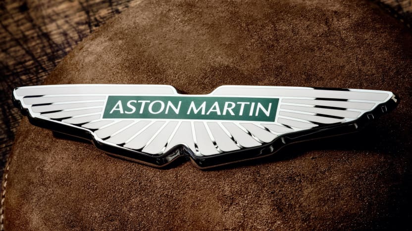
Aston Martin has redesigned its iconic wings logo for the first time in almost two decades, but even car enthusiasts may be hard-pressed to spot the difference.
Perhaps in an attempt to turn attention away from its financial woes, the iconic British brand announced a “bold new creative identity” this week – shortly after revealing it had received a massive $1.1 billion investment from the Public Investment Fund of Saudi Arabia.
The Saudi investment will help cover Aston Martin’s mounting debt – which is approaching $1 billion, according to the company’s own reporting – and assist with the development of new models, including the Valhalla plug-in hybrid supercar.
As part of the brand’s new “strategic repositioning”, Aston Martin wants to roll out the new version of the hand-enamelled wings logo on its next-generation sports cars.
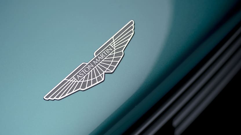
views 4 images![]()
The refreshed logo will make its official debut on the livery of the Aston Martin F1 team at the French Grand Prix on July 24.
In a release, Aston Martin described the image overhaul as “the largest investment in Aston Martin’s brand for more than a decade”.
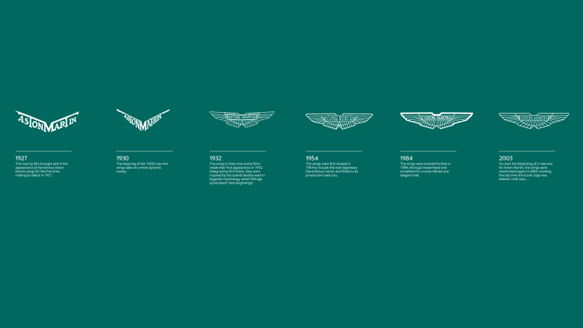
It also marks the first update to the brand since 2003 and only the eighth time in Aston Martin’s 109-year history the logo has been significantly adjusted.
Interestingly, the eight logo changes have followed periods of financial difficulty for the company, often coinciding with the brand declaring bankruptcy.
Logo changes have been carried out in 1920, 1927, 1930, 1932, 1954, 1984, 2003 and 2022.
Meanwhile, Aston Martin has declared bankruptcy seven times in its history: in 1924, 1925, 1932, 1947, 1974, 1981 and 2007.
views 4 images![]()
This most recent logo redesign was carried out by Aston Martin’s in-house design team, with British art director and graphic designer Peter Saville, and the physical badges will be hand-crafted by artisans in Birmingham’s jewelery quarter.
While the new logo is not drastically different from its precursors, it’s a departure from the original Aston Martin logo, introduced in 1920 – which was a circular design combining the letters ‘A’ and ‘M’.
The marque first adopted the wings motif in 1927, when it rearranged the name ‘Aston Martin’ into a deep V-shape.
In 1932, it introduced a more familiar version of the logo we know today, inspired by the scarab beetles of ancient Egypt, thought to symbolize “new beginnings”.

Read more about Susannah Guthrie ![]()


